About Me

My photo
I LOVE to design and to paint whimsical items that will put a smile on your face. Each day I share my simple life with you as I try to encourage, to inspire and sometimes JUST to make you smile as I recount my life growing up on a dairy farm! I've never had many material items in my life, BUT I have been blessed beyond words with love and encouragement from WONDERFUL Parents who instilled in me WHAT was important. I have had EVERYTHING that I needed and WAY too much of what I wanted. I am slowly learning to be a better person each day through my interactions with my friends on Facebook. Some day I hope to be as good as people seem to THINK I am! I am BLESSED! Welcome to my little corner of the world...Please stop by and visit often!
Showing posts with label DecoArt Mixed Media. Show all posts

Friday, July 8, 2016

Tutorial Thursday


I am a member of Tole Town. It is a fun place that offers 3 patterns a month and a line drawing challenge.  I have a friend who is always the first to post hers, and once someone posts, it is difficult to think of something different, because your mind is focused on the cuteness of your friend’s creation!


I always feel that I have to put this disclaimer into every pattern I share on my blog, lest someone think I am hiding some deep dark secret~~no secret.  DecoArt is the Best in my opinion, so, here goes: I am also a member of the DecoArt Helping Artist program that allows me to get some free products, but mostly, I buy things at a discount, which is great for me, because I LOVE to try new things.  I have used DecoArt Americana paints for over 20 years, so obviously, I use them because I love them.


I am fascinated with Mixed Media and have spent quite a while learning how others use these products.  I have to admit, I am not a fan of gluing things on things, but I LOVE the process of using textures and building layers and colors.  SEE—if you look for something you like, you will usually find it!  If I do start to glue charms on top of charms and fake flowers, PLEASE form an intervention for me.  And, by all means, when you see me painting a skull, you best fall to your knees!  LOL


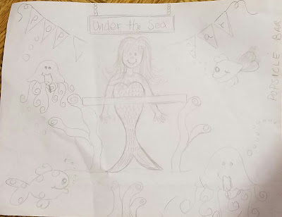
As I was chatting with my friend who finished her line drawing challenge, I left with some good ideas.  THEN, as I was doing another scroll through fb-land, I saw that DecoArt Media was having a Mixed Media Challenge called “Under the Sea.”


Ok, those who follow me KNOW that Mother did NOT believe in coincidence!!  SO, I grabbed a piece of paper and sketched something really quickly…honestly, I did it in about 10 minutes.  Yes, it might actually look like it took me 10 minutes, or less…that is ok. As long as you don’t tell me that, I can live with you not appreciating my silliness! Chances are, even if you do tell me, I will probably get over it, too…


It would be politically incorrect for me to share that my mermaid looks like a drag-queen mermaid, so I will not say that, because I will NOT be unkind, and what?  Me? Make fun of my own skills?!!  Ne-va!!


I have been sharing some step-by-steps of the process in this post. I’m not going to type instructions, because hey, I’m not getting paid to make a pattern!!  (she says giggling…)  I am amazed at how something so simple can use so many different products…how do I keep doing that.  I am going to do a self-challenge one day and do something with only 4 or 5 colors.


Sooooooooooo….here is a list of the colors I used to paint this on an 8x10 Canvas board.


BUT FIRST, I want to give credit to Lorrie Weber for the cute little jelly fishes…Thank you, Lorrie…this was fun.  She owns the copyright to them, and it is only nice to give credit when you use someone’s drawing.


I made my FIRST print using my gelli-print that I won over one year ago.  To make the paper, I used the DecoArt Americana Colors: Citron Green, Boysenberry Pink, Tangerine.  This paper was used to make the banners, the table and the jellyfish.  Honestly, the banners look just like I painted them.  I am thinking I might not be a good gelli-print Ambassador—Sorry, Geli Print People—others do AMAZING things with them, and I am in awe.


DecoArt Media Fluid Acrylics: Translucent White, Carbon Black, Yellow Green Light, Viridian, Diarylide Yellow, Raw Sienna, Burnt Sienna, Metallic Gold, Dioxazine Purple, Cobalt Blue Hue, Cerulean Blue, Cobalt Teal Hue, Primary Magenta and Green Interference.


DecoArt Media White Gesso, DecoArt Media Matte Medium

DecoArt Metallic Lustre, Majestic Purple


Just a few hints of the process:

I used a piece of Punchinello to stencil Gesso onto the background.  For some reason, when I think of doing something with the sea, I think of bubbles, which reminds me, saying BUBBLES is hard when you are angry, and I have been angry today, so once again, ART is just what the Doctor ordered.


The background was created using Translucent White and Cerulean Blue in the middle and working Cobalt Blue Hue around the edges into the lighter background.  I seem to like a lighter center with a darker edge.


What I forget about when I use these wonderfully pigmented Fluid Acrylics, is their translucency.  It is so fun to build colors, but when I did my turquoise fish, I laughed as the Purple I added turned into a dark blue!!  I had visions of a purple/turquoise fish, but that is ok…I am capable of powering through.  I could have changed it, but he just seemed that he was meant to be...it had NOTHING to do with my being lazy~~maybe...


I added Green Interference on top of the Mermaids fish suit.  It looks really cool in person…


The sand is Metallic Gold instead of a traditional sand, because, isn’t the magic of the sea, the treasures she hides?  Who KNEW there was a Popsicle Bar under the sea?  Perhaps I should learn to dive, after all… (nope, not happening, I hope…Another Mother saying, “Don’t say what you are not going to do, because you will end up doing it!”  Yikes…better not chance this one…)


I added Translucent White to tone down the colors and to make them more pastel for the popsicles.  Also, I based the fish with Translucent White, before I painted them.


Oh, I forgot that I used a Fudeball pen to outline the banners, table, and jellyfish…I have to admit, that I am enjoying how easy they are to use, and I might be getting lazy by using them…that is ok. Something in life should be easy, right?


I finished by adding Majestic Purple Metallic Lustre around the edges.


This is what my pallet looks like after this was painted...see the little dots...it takes very little paint!


AND, by all means, don’t waste paint!  It drives me crazy to watch videos where paint is wasted.  It take a VERY small amount of paint to create any of these objects…just put a small dot onto your pallet, and add to it if you need more.


I think everything is just straight up painting…If I can do it, then YOU can do it…just have fun!  Life is too serious and unkind, so doing something for JOY is such a gift…I do not take this gift of art for granted, one bit. Will my art change the world?  Absolutely not, but it does CHANGE ME, so that is a good thing.  I am simply blessed to create~~charlotte♡

Tuesday, January 26, 2016

DecoArt Winter Challenge--Happy Birthday, Momma

I picked up the phone before I went to bed and my heart grew heavy....it was Mother's birthday...one more year has gone by without her.
The twins-- Mary and Martha

I went to sleep trying to figure out what I would do to CELEBRATE her day. I  had wanted to enter the DecoArt Winter Challenge. I  had some ideas, but I started thinking about doing something to honor Mother's memory...so I slept on it.


When I awakened, I gathered my supplies. My Mother was one of the most creative people, so this seemed like the perfect way to spend my day.


Supplies:
5x7 wrapped canvas
Mini Mister by rangerink.com
Flutterbies Stencil, Tracy Moreau, Americana
Whirlpool Stencil, Andy Skinner, DecoArt
Americana Decou Page Paper, Victorian Romance, the music sheet

DecoArt Media:
Crackle Paste
Modeling Paste
Gesso
Matte Medium
Tinting Base
Shimmer Mister--White
Liquid Glass

Fluid Acrylics:
Quinacridone Violet
Cobolt Teal Hue
Cobolt Turquoise Hue
Blue Green Light
Paynes Grey
Phthalo Turquoise
Dioxazine Purple
Turquoise Interference
Violet Interference
Blue Interference

DecoArt Snow-Tex
Ice Crystal Glamour Dust
DecoArt Pallet Knife

Brushes:
#10 Flat
#4 Round
10/0 Liner
1/4 Angular

I had a 5x7 canvas I had put Crackle paste on a few months ago...yep it got kinda dirty!


I knew this was to be a winter scene, but I wanted to have items in this that were special to Mother.

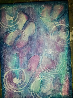
A butterfly was most always worn on Mother's  left shoulder when she left the house, so butterflies would be in the background!

 I  used Tracy Moreau's stencil, Flutterbies, to add them with Modeling Paste...I like it!


I started adding color to my dried canvas. I started with Q. Violet, spritzing one squirt of water onto my paint on the pallet so it would be thinner and not so dark.

The colors we are to use are Purple and Blue-- very appropriate since Mother's twin wore pinks (light shades of purple) and Mother wore blues!


Cobolt Teal Hue was added next--no rhyme or reason, just put it around. ..be sure to put some on the edges of the canvas.  I spritzed water on the paint, again.


You can see that I use very little paint.


I continued to cover my canvas with Cobolt Turquoise Hue...more water spritzed on top of my paint on the pallet to keep it light and airy.


Color building continues with Phthalo Turquoise...this is a strong color, so be careful.

I added the whirlpool stencil with Tinting Base to resemble snow...now we are getting to Winter!


It wasn't exactly how I wanted it to look, so I brushed Tinting Base all over--perfect! It gave it a foggy, snowy, cold look! Yes!


I drew my heart-shaped flower next...it had to be something to do with love!

Mother told most everyone she spoke to that she loved them. She spoke at dozens of churches in my childhood denomination  (Cumberland Presbyterian) and spread the message of John 3:16, being certain to always include verse 17, because she said THAT was just as important!  That woman loved and was loved!

I used gesso to base my flower.


The heart was painted Q. Violet. The stems were based Blue Green Light and highlights/shading done with Cobolt Turquoises and Tinting Base.


I outlined the design with Paynes Grey.
I  added Phthalo Turquoise to resemble snow melting from the flowers, because I wanted it to symbolize that LOVE KEEPS US WARM.  I added Liquid Glass on top of the drops of water and on the base of the flower and then I placed a puddle of water splashing...this was surrounded by Snow-Tex.


LOVE was cut from Americana Decou Page Paper. I used the music from the Victorian Romance package.

Music was very important in my house. Mother had a beautiful alto voice and she would sing with her twin sister when they were teenagers.

Mother sang most all day as she worked around the house. I would get frustrated listening to her singing the same things over and over, but now, I understand it was her way to pray and to help ease her heart...what a silly brat I was!

Most of what I did to finish the canvas will not show up on camera.

I attached the music with Matte Medium.

The letters L,V,E were painted with P. Turquoise. The O was Q. Violet. I painted the Turquoise letters with Blue Interference and the Violet with Violet Interference. The leaves were painted with Turquoise Interference.

I painted BLOOM, my word for 2016, with P. Turquoise.

All letters were outlined with Paynes Grey.

Ice Crystal Glamour Dust was painted over the dried Snow-Tex.

I  shaded around the design and the edges of the canvas with P. Turquoise   and then with Dioxazine Purple.

I  used a stiff toothbrush to splatter the White Shimmer Mister on top of the design to look like snow.

The canvas was sealed with Matte Medium.


Happy birthday, Momma....I miss you...I wish I could have been a better daughter. You taught me so much and I am working on doing better! Hug Daddy for me and my Aunts/Uncles! I was a lucky girl!

Notice the butterfly on her shoulder  And the button necklace that she crocheted! 

Thanks for stoping by...I wish Blessings to YOU...~charlotte♡

Quote by Thoreau

Thursday, November 5, 2015

Embrace Life, Thursday, November 5, 2015


I fear I will have to apologize in every post until I do better, for the poor pictures…Taking a picture without being able to SEE what you are photographing is quite adventurous, but it is what it is and it will do until I find a new camera…so Use your imagination that the colors are bright, vivid and have no glare!


It started on an unseasonably warm November Day in Middle Tennessee. 


Everything was going well when I decided that I wanted to give Tracy’s stamp that I had won a try.  I just had a simple project in my mind and knew it wouldn’t take too long.


I began to read the directions on the back of the stamps, and that is when I took a turn down the daisy hole (sorry, there were no rabbits in sight)…


The directions said to  “stamp on scrap paper the very first 2 or three times to prime the stamps”.  I had no scrap paper where I was sitting, so I just decided to try them on my 8x10 canvas that was in my lap and I would just paint over it~~no biggie.


I stamped and stamped and stamped, and then ONE MORE stamp for good measure…I got up to go wash off the stamps because I was not going to use them until I had, in my mind, covered the canvas in pretty bright colors and then I was going to STAMP on top of that for a hippie-style daisy…it was going well…


I came back and pulled out the white gesso and painted it in criss-cross patterns to give some texture….still going well as I pulled out ye olde hairdryer.


Things suddenly took a turn…not your normal style of painting…after all, I have been creating something since a little kid, and I am now OLD and know that all projects have a proper logical order and in painting, one should always paint the back ground FIRST and build from there…yeah, Momma said that since I was a baby, if she said the sky was BLUE, I would say, “No, it’s (insert color here)…”  I am saying that I knew my colors as a small child and THAT is the story I am sticking to (it had nothing to do with me being a disagreeable child who argued since she learned to speak…heavy sigh.)


I thought I would just pull out a color and paint the petals and the center and it would give me a direction to go to when I would place the flowers at their proper time~~LAST.


Diarylide Yellow filled the centers/leaves/stems and  Pyrrole Orange colored the petals (ok…I painted 38 pumpkins for an order yesterday and I needed to know that Orange could be used for more things than just a pumpkin!)


Ok…I kinda like that…so I pulled out some of my favorite colors and just started painting in the background  (careful and don’t get on my petals, the mind YELLED!) with Quinacridone Violet (what is wrong with just saying VIOLET??) and then Quinacridone Magenta (really?  I’m Southern…what do you think that is going to sound like when I attempt to say it???)


Next came some Cobalt Teal Hue and some Blue Green Light on the leaves/stems….OH YES…Pretty colors…see how they change colors as I add layers…I love playing with these paints!

 I roughly dry-brushed my favorite color, Phtalo Turquoise (again???...what is that word…ok…so, I am at least familiar with this word from my one watercolor class in college…see Mom, I did learn something other than to burp on command!)…Look how it changes colors with each color I paint over…isn’t that the coolest thing ever!  Can I tell you how much I love COLORS!


I thought I might as well go with it now, so I pulled out the Carbon Black and outlined the flowers…I really should have taken more time with this, but I was just playing…still learning how to do this style…


This experiment sure had taken a dark tone, so I pulled out the drywall tape and scruffed in some Titanium White and added the word to the top…added some curly q’s and I am calling it DONE and you know what…I LIKE IT!!  I did attach the “embrace Life” with Matte Medium.  I had stamped it on the envelop that my stamp came in…I need some more work on stamping the words…so I went over the words with my black pen…


OK, Tracy, I will absolutely understand that the next time you have your husband pick a number, that you will tell him to pick a number between 1-100, but stay as far away from 79 (or whatever my number happens to be) as possible…I’m sorry…I KNOW this isn’t how we are SUPPOSED to use stamps, and MAYBE one day I will do better, but I sure am not going to promise that!


Thank you, Tracy, for the inspiration that you give to me and to countless others…your caring heart shines in your creations and I am so glad that our paths have crossed…

If you don't, Please follow Tracy on her website/blog to learn the PROPER way to do things!  =)  This will take you to Tracy's website.  You can also join her on many Monday Nights to see her create a project in about 1 hour (find them on You Tube)...You can LIKE her also, on facebook...she is EVERYWHERE and of course, she is the DecoArt Education Coordinator...my FAVORITE products and I am so happy to be a Helping Artist with DecoArt!!  Yippie Skippie!


I know, Tracy is thinking “please, don’t let anybody see this, please, don’t let anybody see…OH HI, everybody!”  but you are far too kind to ever utter what is going on in your head out loud (well, most of the time.).  Thanks for letting me play with some of your toys.


Tonight, I embraced LIFE…I LOVE life and am so blessed to simply create…I wish Blessings to YOU…~charlotte


My supply list: I apologize for any misspelled words...

DecoArt Media Fluid Acrylics:

Diaryliade Yellow,

Pyrrole Orange

Quinacridone Violet

Quinacridone Magenta

Cobalt Tea Hue

Blue Green Light

Phthalo Turquoise

Carbon Black

Titanium White


Gesso White and Matte Medium