I have to admit that I have jumped on the band wagon with both feet! I am having so much fun with the DecoArt Media Line!!
I also have to admit, when it was introduced, I thought WHAT IS THIS? And I kept seeing it and I kept wondering the same thing!!
Somehow in my mind, I thought it must be paint that can be used for media...such as coloring on Poster Board or paper or to paint cartoons...I had no idea...NOW, to be honest, it CAN be used for these things, but it is so much more!!
I have another thing I must admit...I can't say the names of these colors!...sigh
BUT it doesn't matter...I am in love! I can learn to fake a name here and there!
The question I keep getting is WHAT is this and WHY do I need it...
WELL, first of all, IF you are a true painter, you ALWAYS need another kind of paint, right??
These paints lend themselves to mixed media, but PLEASE don't limit them to just that...they can be incorporated into all of your work. If you want to make something RUSTY, you cannot do without the Quinacridone Gold~~it is magical.
The paints are HIGHLY pigmented. They are bright and vibrant and do no lose their intensity when added to the mediums that are available (crackle paste, paste).
These colors are transparent, but DecoArt would not let you down, they came up with a tinting base that you can add these colors to to make them opaque!
You can stack the colors on top of each other and still have the base coat shine through...You can paint on top of your newsprint/music and it tints the paper without covering up your original object.
I thought I would share one of my projects.
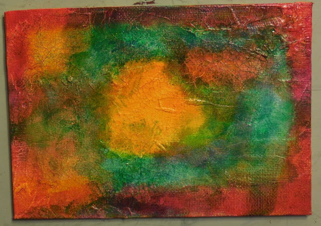
I began by covering my canvas with Crackle Paste and let it dry overnight...I randomly covered 5, so I could have fun playing...I added it thicker around the outside edges and on the thick canvases, I added it to the sides, also.
I started by cutting my sunflower petals too big!! YIKES! But have no fear, scissors were near!
I then started by adding yellow to the center. I wiped it off of my brush by spreading it on other sections of the canvas. My thinking is light in the middle and darker on the edges. I guess I had beginners luck, because I didn't have to wipe off a lot of paint. It kinda came out neat the first time, but just keeping adding colors until you are pleased with the look. I WISH I could figure out a way to make a living by doing only backgrounds...YES...it is THAT fun!

I really thought I was going to paint a larger pumpkin with just the word THANKS, but it didn't happen that way. I drew a couple of pumpkins but did not like them, so I was happy with this. I started by adding Orange and it was TOO orange, so I started grabbing colors of darker oranges and toning it down. I added the darkest color to make the pumpkin sections. I did this with the edge of my brush and just blended it in. Then I ended with adding some yellow for a highlight in each section. The stem was done the same way. I just added the brown and added lighter/darker colors until I liked it.
 |
| Right click to save the picture to your computer if you need it...remember to cut the flower petals longer to go behind the circle so it will be easier to assemble! |
I painted the petals of the sunflower with all the colors left on my pallet. Let me tell you, it takes just a very very small amount of paint. I put out a dollop smaller than a dime. I painted half of my petals darker, thinking they would be the BACK petals. I lost some petals during the process of attaching them with Matte Medium, but no problem, no flower is perfect...I like the uneveness of it and think it adds to the charm~~that is my thinking and I am sticking to it!!
The center was painted with brown and then a little Carbon added to the left side. I added dots of white/yellow/black.
I printed my words on the computer, cut them, painted them with the paint on the pallet, and attached them with Matte Medium.
When everything was dry, I outlined everything with a 10/0 liner brush and Carbon...I added random clusters of Carbon Dots...Sealed with the matte varnish...SO EASY and there is no right or wrong to doing this!!
Never be afraid to try new products and new styles because this is how we grow as artists...Do not say you CAN'T, but instead DO...you will get better with each attempt! I'm still growing and loving it!
Happy creating...Blessings to YOU...~charlotte
These are the colors/mediums that I used. Do not feel like you have to use all the colors I did...honestly, some of them really didn't add much, so I didn't use enough to matter, but I thought I needed to list everything! ;) I am in love with the Turquoise colors...they have stolen my painting heart!
DecoArt Media
Fluid Acrylics:
Diarylide Yellow
Green Gold
Phthalo Green-Yellow
Quinacridone Magenta
Cobolt Turquoise Hue
Quinacridone Gold
Quinacridone Burnt Orange
Pyrrole Orange
English Red Oxide
Raw Sienna
Burnt Umber
Titanium White
Carbon Black
Matte Medium
Gesso
Crackling Paste
Other Supplies;
5 x 7 Canvas (a stand if you wish)
Brushes of your choice and a good liner (10/0)
I used scruffy brushes
Dictionary Page
Words of Choice (I printed them on the computer)


